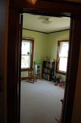
Here is a BEFORE pic:
And if you remember this post, my design inspiration was this photo:
I wanted the playroom to be bright and cheery. So we chose a light green paint. Our kitchen is red and yellow, the dining room is a dark green, so I thought the light green would match well. So here it is!
It doesn't look so bad in the pictures, but compared to the warm tones we have in the rest of the house, this just looked fluorescent! And I just did NOT like it! So without much of a plan in mind I went with something entirely different and re-painted!! Stay tuned...


2 comments:
I love room make-overs! Can't wait to see what comes next!
Oh i hate it when you paint and then don't like the results! Can't wait to see what you changed to!
Post a Comment